TL;DR
I audited Sea Shepherd’s home page and online shop for accessibility and ethics. The buttons are consistent, but the orange fails contrast and most images have no alt text. I turned the findings into three design rules and a redesign of both pages.
- Contrast of white text on the orange donate button. AA needs 4.5:1
- 3.4:1
- Images on the home page without alt text
- 25 of 28
- Ethical risks found with the Tarot Cards of Tech
- 3
Overview
An NGO that asks for donations, tested for who can use it
A review of Sea Shepherd’s home page and online shop: what stops people from reading, trusting and donating, and how a redesign could fix it.
Problem
Hard to read and hard to trust.
Orange buttons with white text fail contrast on both sites, most images have no text alternative, and the home page has no main heading. The shop mixes 13 button styles and shows unfinished copy.
Objective
A donation journey anyone can complete.
Keep Sea Shepherd’s black, orange and condensed type, but make every call to action readable, consistent and predictable, and show where the money goes.
Skills
Audit, ethics, wireframes and UI design.
WCAG 2.2 checks, the Tarot Cards of Tech, low-fidelity wireframes, and a redesign of the home page and the shop in Figma.
Understand
A first look: what works and what doesn’t
I checked both sites in October 2026 with a browser script for contrast, alt text and target sizes, plus a manual review.
Works
One orange button, used everywhere.
The home page uses the same orange button, with the same shape and type, in every section. The hero carousel has a pause button, and the page has a skip link.
Fails
The orange fails contrast.
White text on the home page’s orange (#F45700) gives 3.4:1, and on the shop’s orange (#E26229) 3.5:1. Text on normal-size buttons needs 4.5:1 to pass WCAG AA.
Missing
Missing and unfinished content.
25 of the home page’s 28 images have no alt text and there is no main heading. On the same page, “Shop the gear” shows empty grey cards, and the shop shows draft copy: “Rewrite Text For New Arrivals”.
Audit · Home page
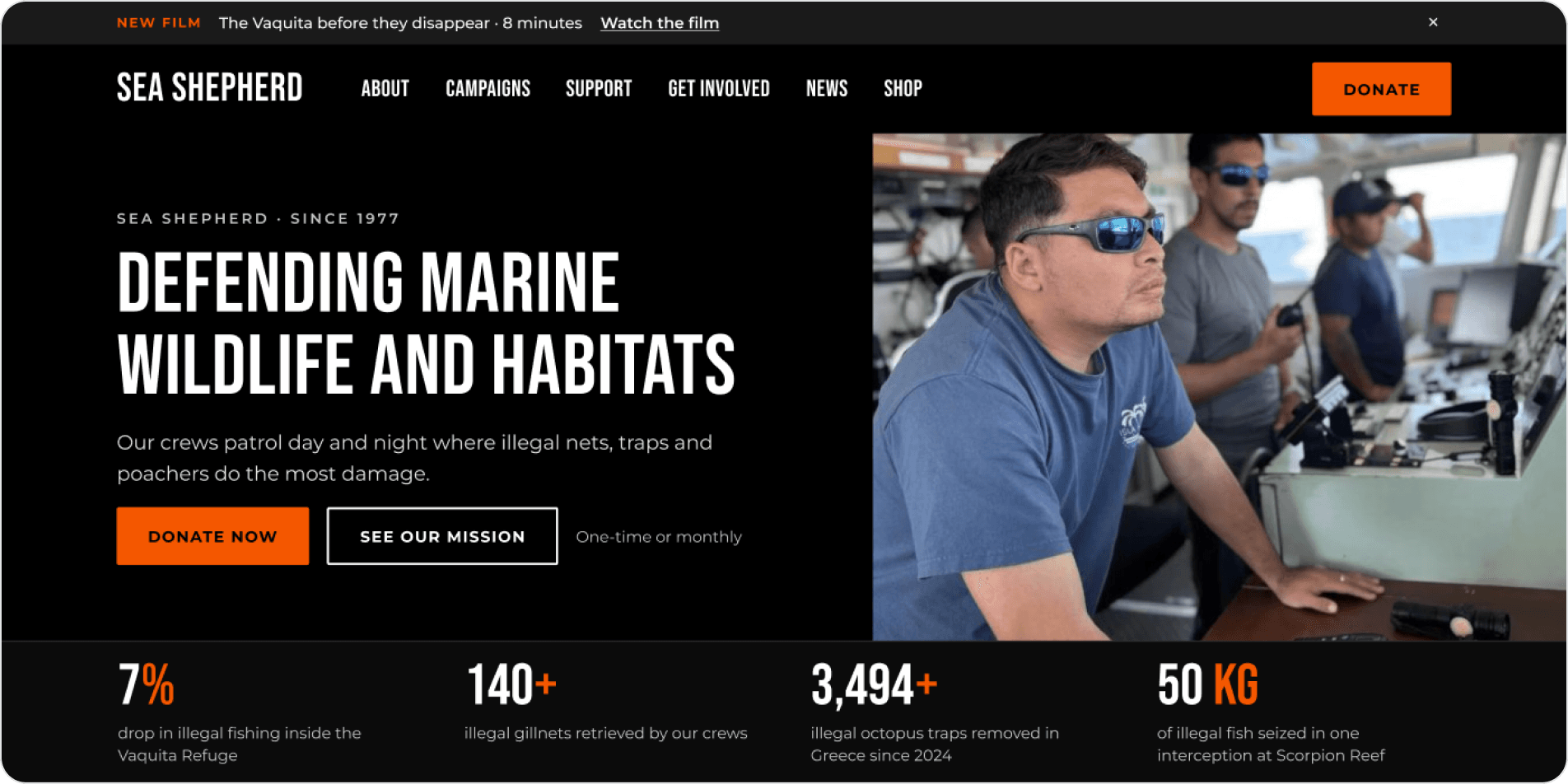
The orange button is too light for white text
One orange is used for every donation call to action, so one fix covers the whole page.
Problem
3.4:1, below the 4.5:1 minimum.
“See our mission”, “Donate now” and “Sign up” use white 13 px text on #F45700. The small orange labels on white cards, like “OP-SCR-01”, fail too.
Proposed solution
Keep the orange, switch the label to black.
Black on #F45700 gives 6.2:1 and keeps the brand colour. Orange text on white backgrounds moves to #C84600 (4.9:1).
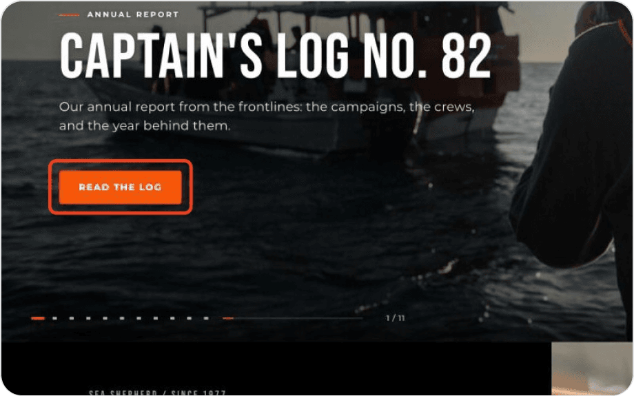
Hero button
White on orange: 3.4:1
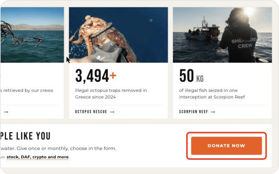
Donate band
Same button, same problem
Images and headings a screen reader can’t use
A screen reader user hears a list of links, but no description of what the page is about.
Problem
25 of 28 images have no alt text, and there is no h1.
The news cards, campaign thumbnails and result photos are read as “image” or skipped. Without an h1, the page has no clear title.
Proposed solution
Describe what matters and add one h1.
Write short alt text for images that carry meaning and leave decorative ones empty. Make the hero headline the h1 so the page has a single title.
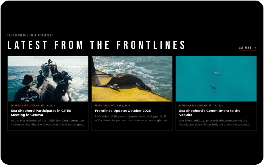
News cards
Photos with no description
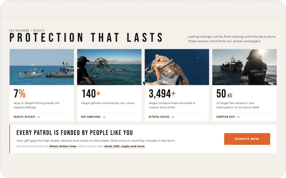
Results
Numbers that rely on the photo above
Small text and small targets
Dark pages with small grey text are hard to read, and tiny links are hard to hit.
Problem
Text under 13 px and links under 24 px.
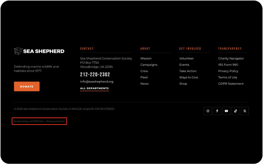
The reCAPTCHA note (11 px, 3.7:1), the map labels (3.9:1) and the menu links (18 px tall) are small. 35 elements are smaller than the 24 × 24 px that WCAG 2.2 asks for, like the social icons and the close button of the Vaquita tab.
Proposed solution
Raise the minimums.
Body text at 14 px or more with at least 4.5:1, and every control at least 24 × 24 px, or 44 px on touch screens.
Footer
Small grey text on black
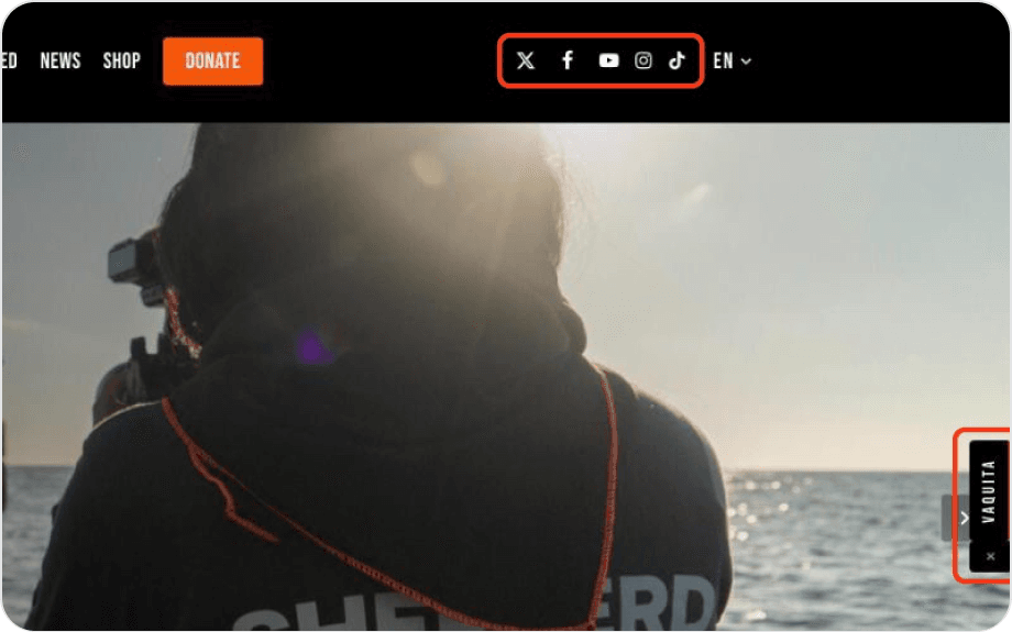
Menu and hero
Menu links 18 px tall
A moving hero and a pop-up before the first ask
The first screen has to say one thing and offer one action.
Problem
11 slides and a modal on a first visit.
The hero rotates through 11 slides, each with its own headline and button label. In a clean browser, a modal about the Vaquita opens on top, with three buttons and “Not right now”. The carousel does have a pause button, which is good.
Proposed solution
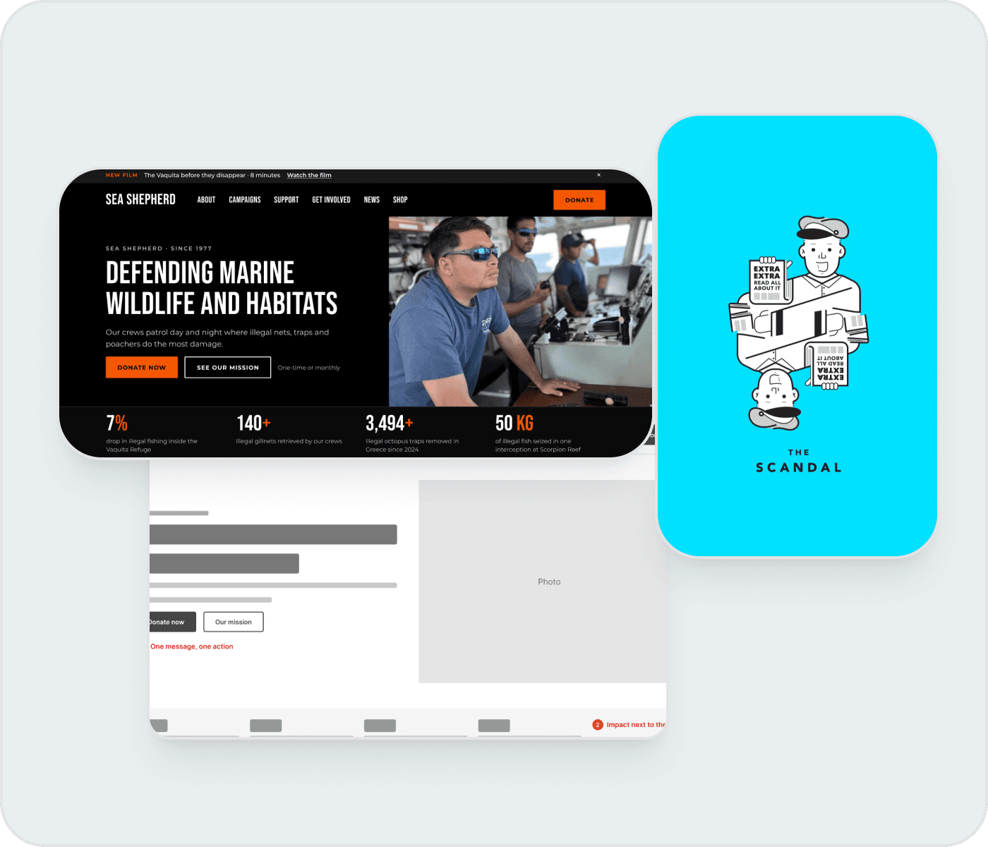
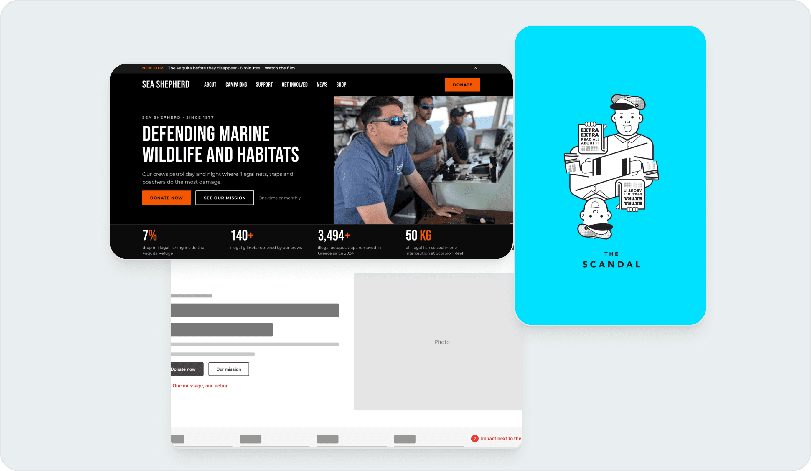
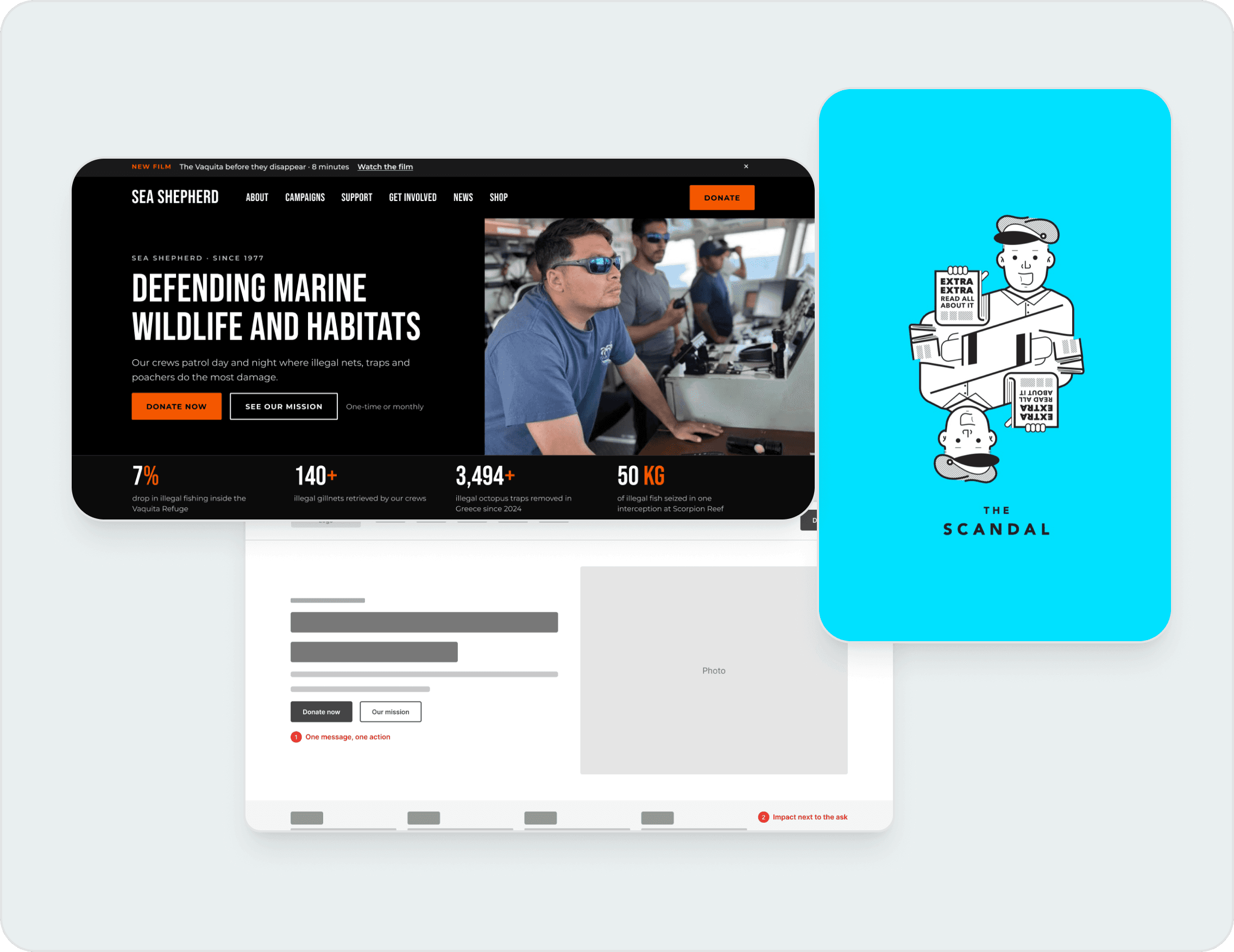
One message, one action.
Show one fixed hero with the donate button and keep the campaigns below it. Replace the modal with a small banner that doesn’t block the page.
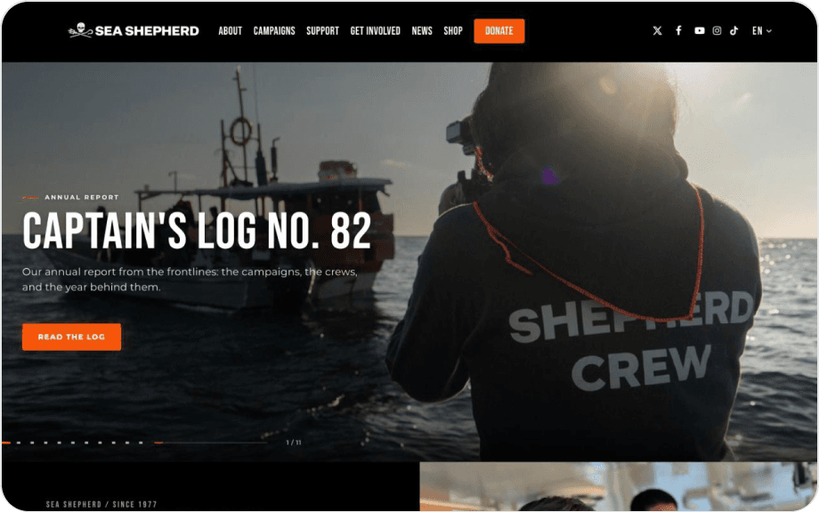
Hero
Slide 1 of 11
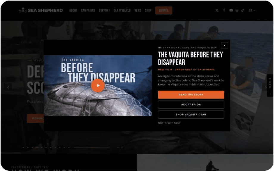
Pop-up
Opens over the page on a first visit
Audit · Shop
Thirteen button styles and an orange that is too light
The shop’s buttons do the same job in thirteen different ways.
Problem
Same job, thirteen looks.
The shop home page mixes square and rounded buttons in black, orange, white and outline. “Add to cart” (white on #E26229) gives 3.5:1, and the category buttons give 3.3:1.
Proposed solution
One button, three states.
Primary (orange with a black label), secondary (outline) and text link, with the same radius, type size and position on every card.
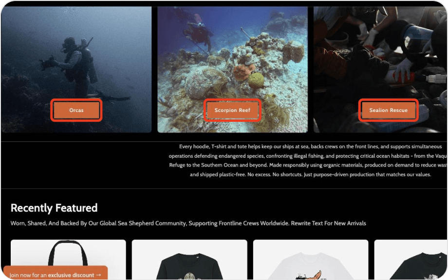
Category buttons
White on orange: 3.3:1
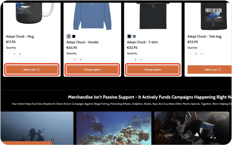
Product buttons
Black, orange and outline side by side
A shop that doesn’t feel like Sea Shepherd
A donor who goes from the home page to the shop may wonder if it is the same organisation.
Problem
Two sites, two identities.
The shop has a different logo, menu, typeface and orange (#E26229 against #F45700). It also shows draft copy (“Rewrite Text For New Arrivals”) and a floating discount pill over the content.
Proposed solution
One header, one orange.
Share the logo, the navigation and the colour tokens between both sites, and remove draft copy before publishing.
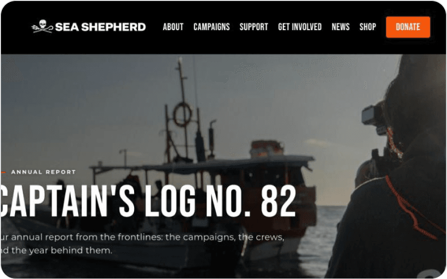
Home page
Skull logo, condensed type, #F45700
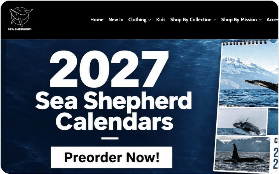
Shop
Whale logo, rounded type, #E26229
Ethical evaluation
Looking at the harm and the good
I used the Tarot Cards of Tech, a deck of 12 prompts that help designers think about the harm and the good their work can cause. Three cards were the most useful for an NGO that raises money online.
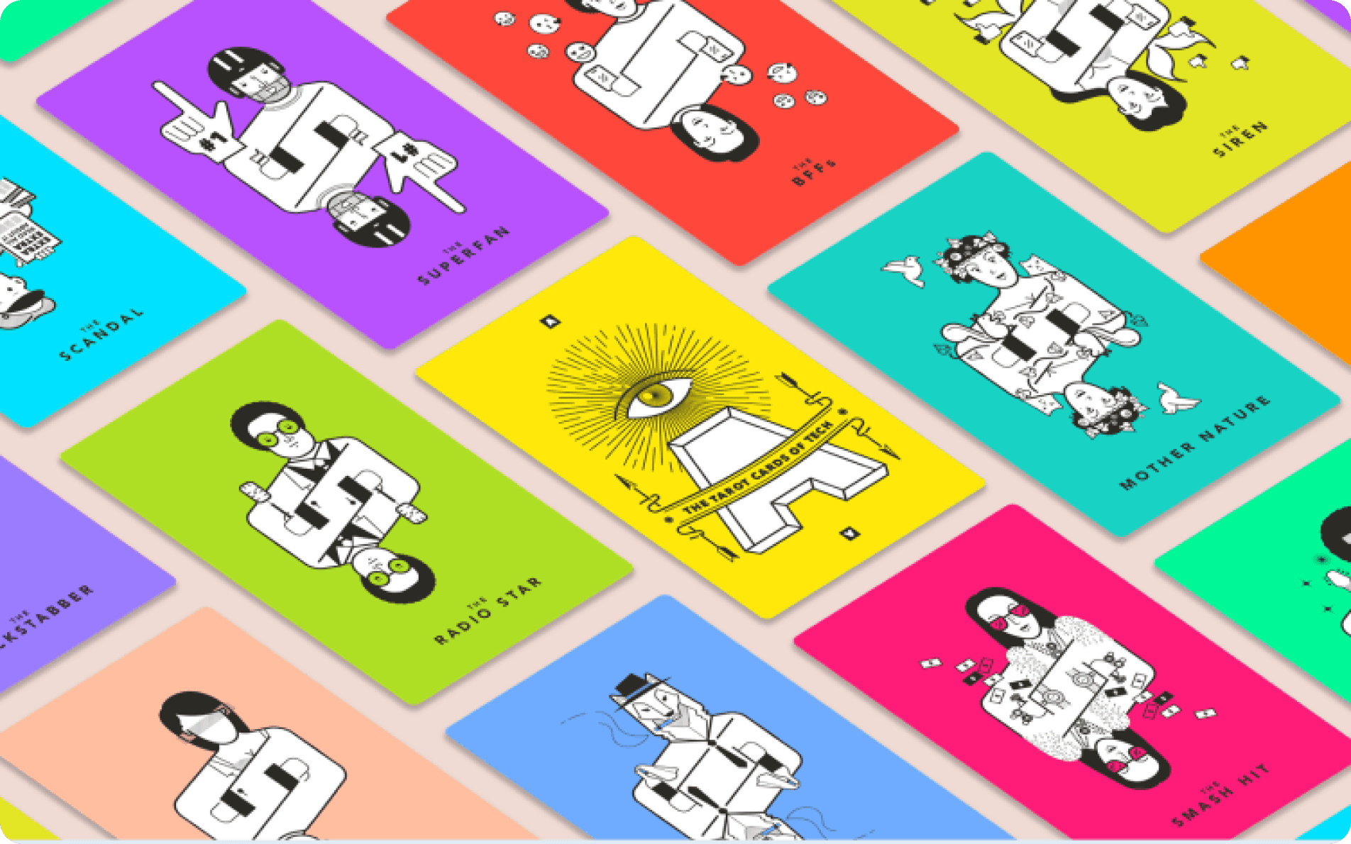
Tarot Cards of Tech
The deck of 12 cards by Artefact
The Scandal
What’s the worst headline about your product you can imagine?
Risk
“NGO makes money from merchandise.”
Sea Shepherd sells hoodies, calendars and mugs to fund its ships. The shop says its products use organic materials and ship plastic-free, but the proof sits in an “Ethical Sourcing” section at the very bottom of a page more than 9,000 px long.
Change
Show proof next to the products.
Add a short “Where your money goes” line to the shop header, linked to the Ethical Sourcing page and to the Form 990 that the home page already shows in its footer.
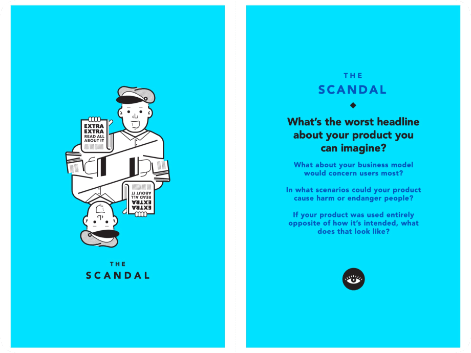
The card
The Scandal
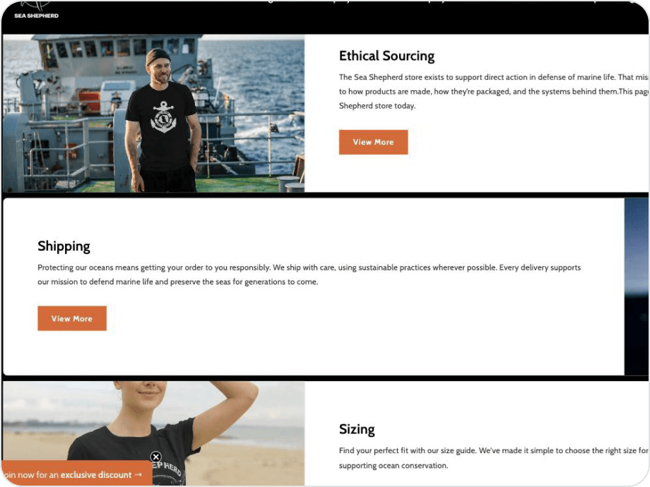
On the live shop
The proof is at the bottom of the page
The Catalyst
How might cultural habits change how your product is used? How might your product change cultural habits?
Opportunity
Merchandise as a daily habit.
Reusable bottles, tote bags and organic T-shirts make sustainable habits visible. The shop already sells totes and mugs, but they are mixed with winter clothing and calendars.
Change
Make the sustainable choice the easy one.
Add a “Reduce single-use plastic” collection with clear filters and one line of benefit: less waste, a reusable alternative, and a donation to a patrol.
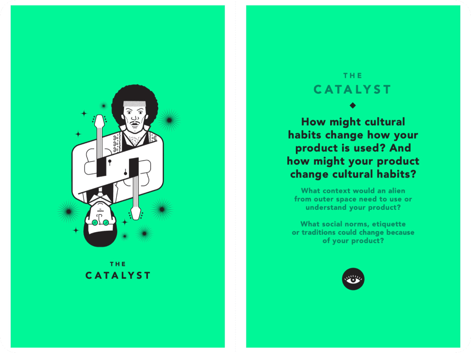
The card
The Catalyst
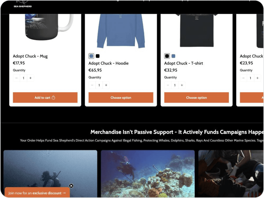
On the live shop
Reusable items buried in the grid
The Backstabber
What could cause people to lose trust in your product?
Risk
Impact is shown, but not on the shop.
The home page has a “Protection that lasts” row with results, such as 140+ gillnets retrieved, and links to Charity Navigator and Form 990. The shop has none of that, so a buyer sees merchandise, not impact.
Change
Bring the numbers to the shop.
Add the same results strip above the product grid, and a donation option next to the cart.
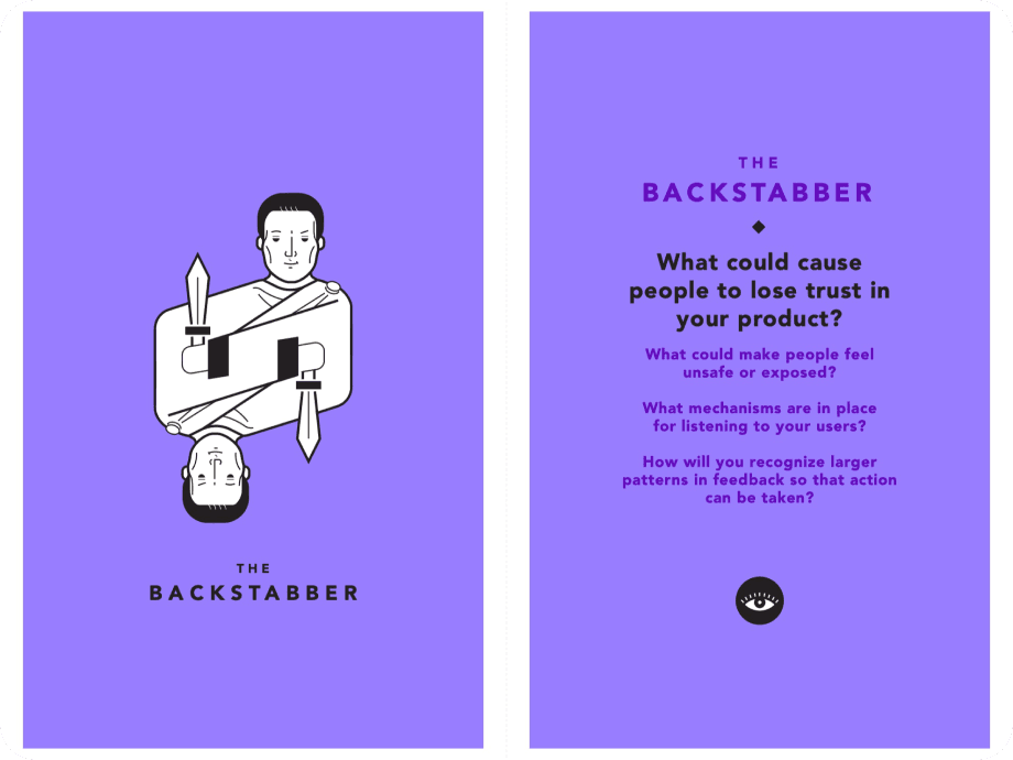
The card
The Backstabber
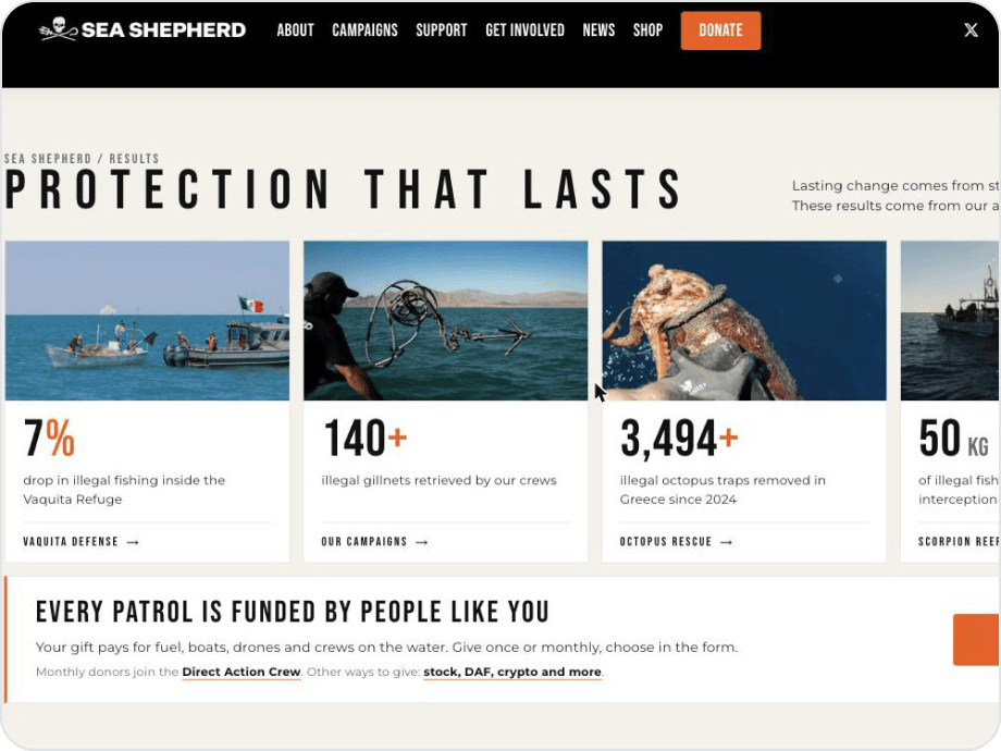
On the live home page
Results the shop doesn’t show
What the audit and the cards asked for
Together, the accessibility findings and the three cards gave me three design rules.
Readable
Black labels on the brand orange.
Every text and button reaches AA, so no one has to squint to donate.
Predictable
One button style, in one place.
The same three button states, the same position and the same size on the home page and the shop.
Honest
Impact where people decide.
Results and “where your money goes” appear next to the donate button and the products.
Wireframes
Low-fidelity wireframes
I laid out the home page and the shop in grey boxes first, to test the order of the content before choosing colours: one message at the top, the impact next, then ways to get involved.
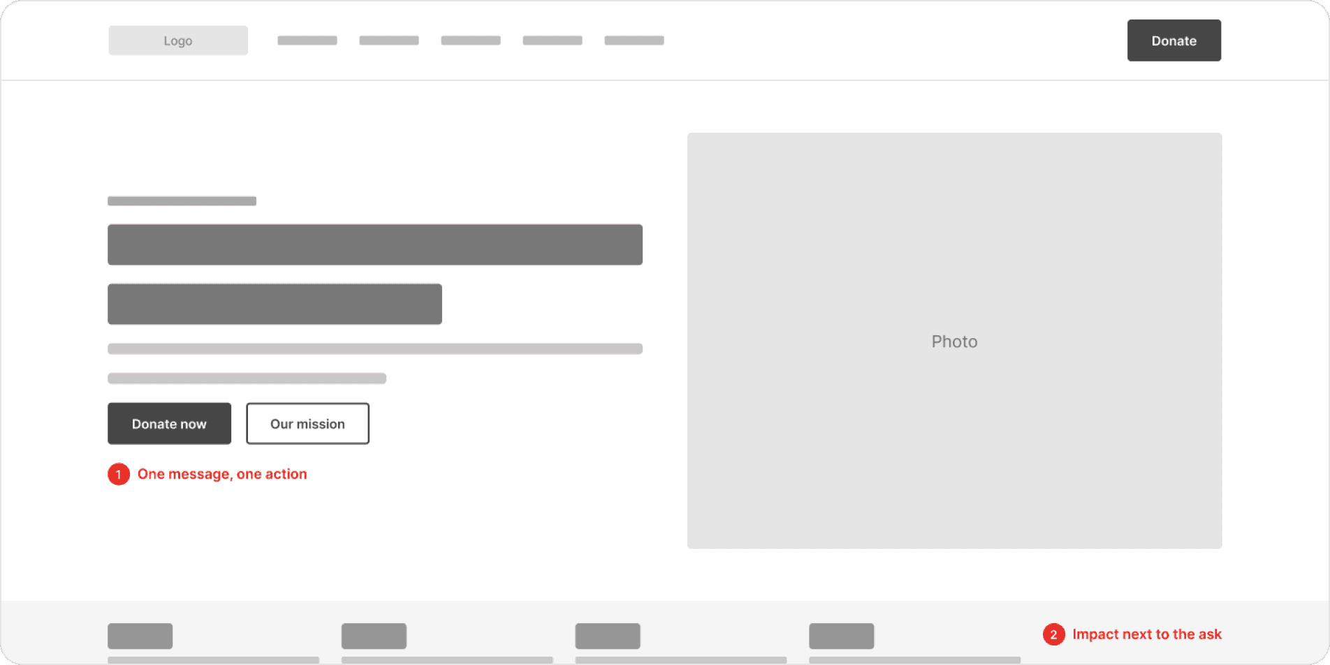
Home page · first screen
Hero, one action, then the impact
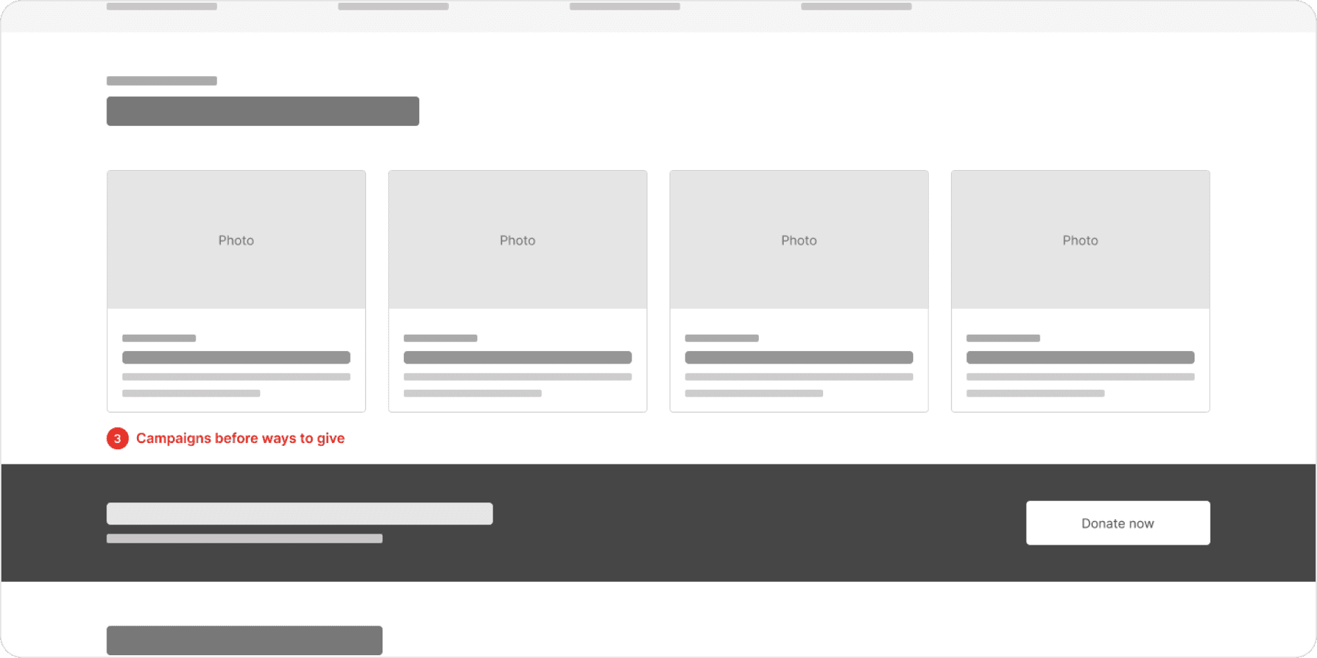
Home page · below the fold
Campaigns, then ways to give
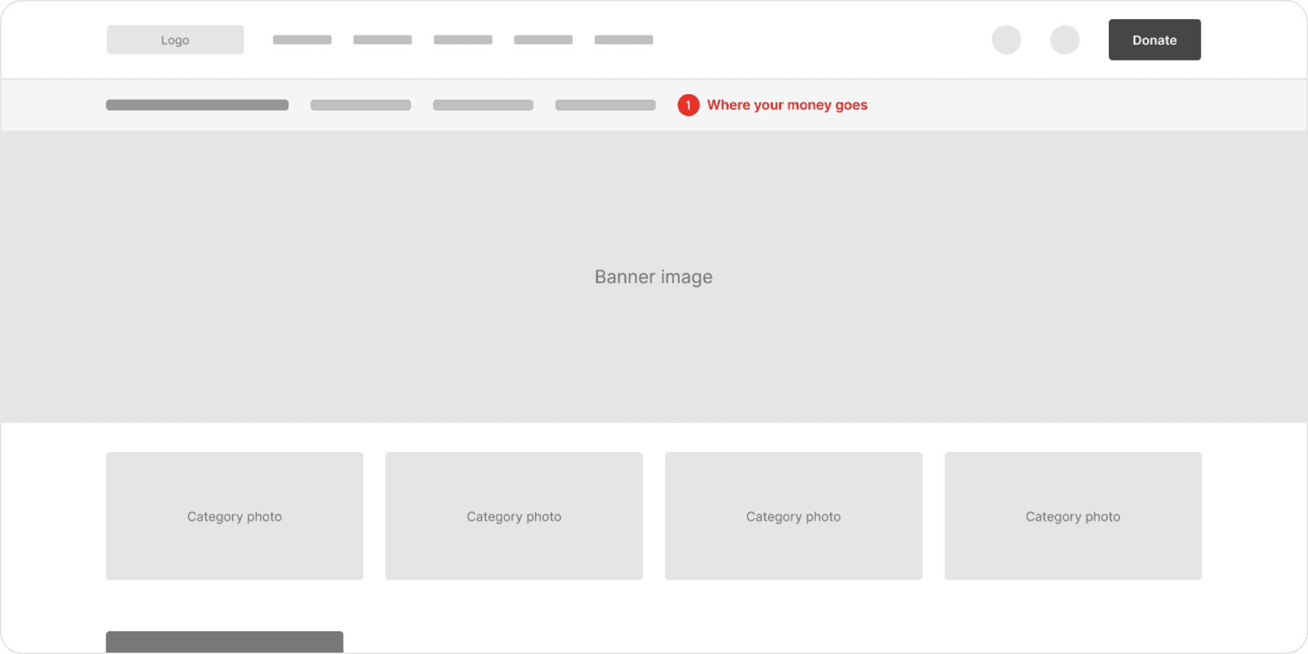
Shop · first screen
Proof of impact before the products
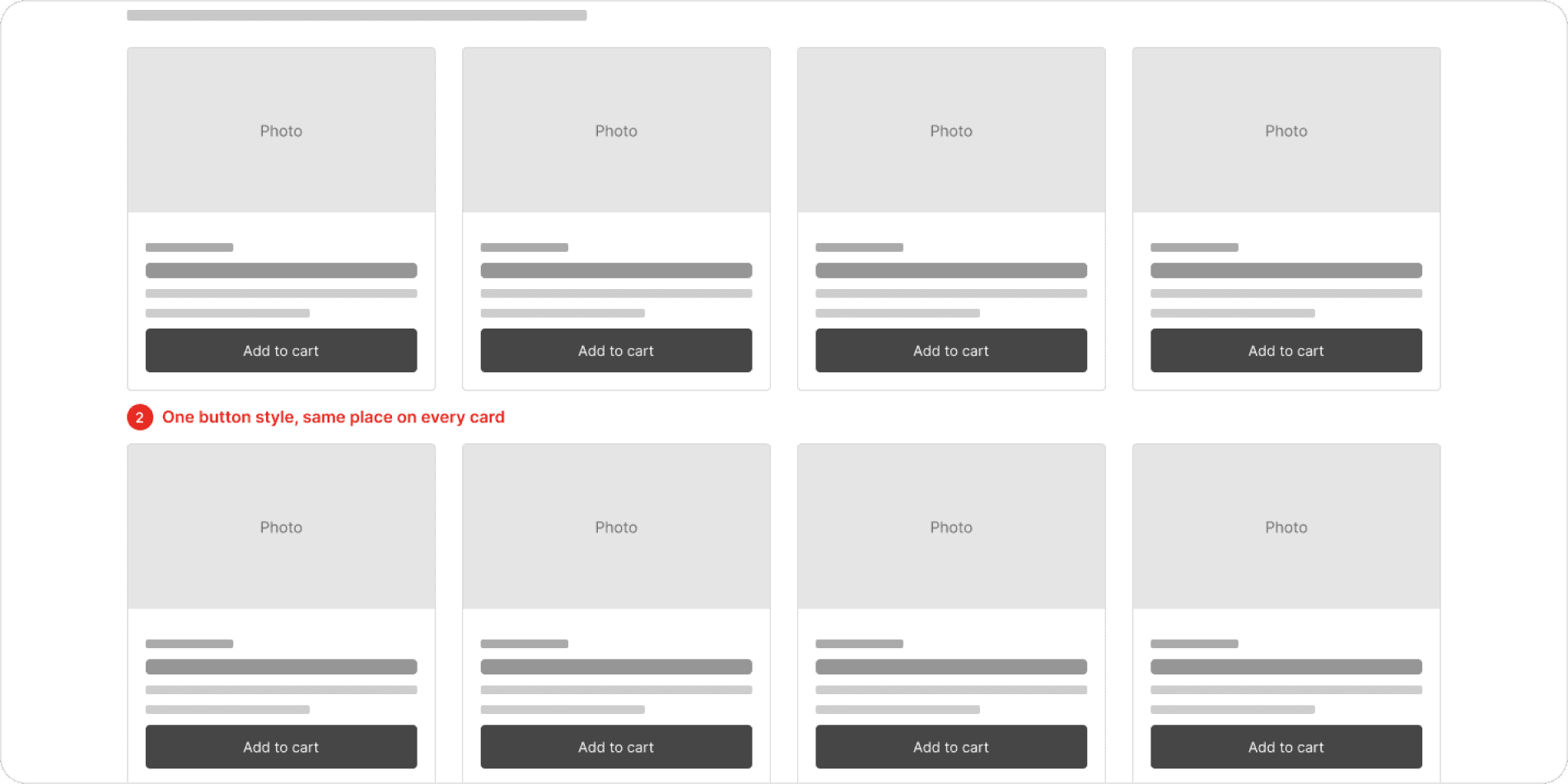
Shop · products and sourcing
One button style on every card
Redesign
Home page: one message, one action
Same black, orange and condensed type, with readable buttons, a fixed hero and no pop-up.
Contrast
Black text on the brand orange.
6.2:1 on every button, and darker orange (#C84600) for orange text on white.
One button
The same button in every section.
Primary and secondary, with the same shape, type and position.
No pop-up
A banner instead of a modal.
The Vaquita film moves to a banner that doesn’t cover the page.
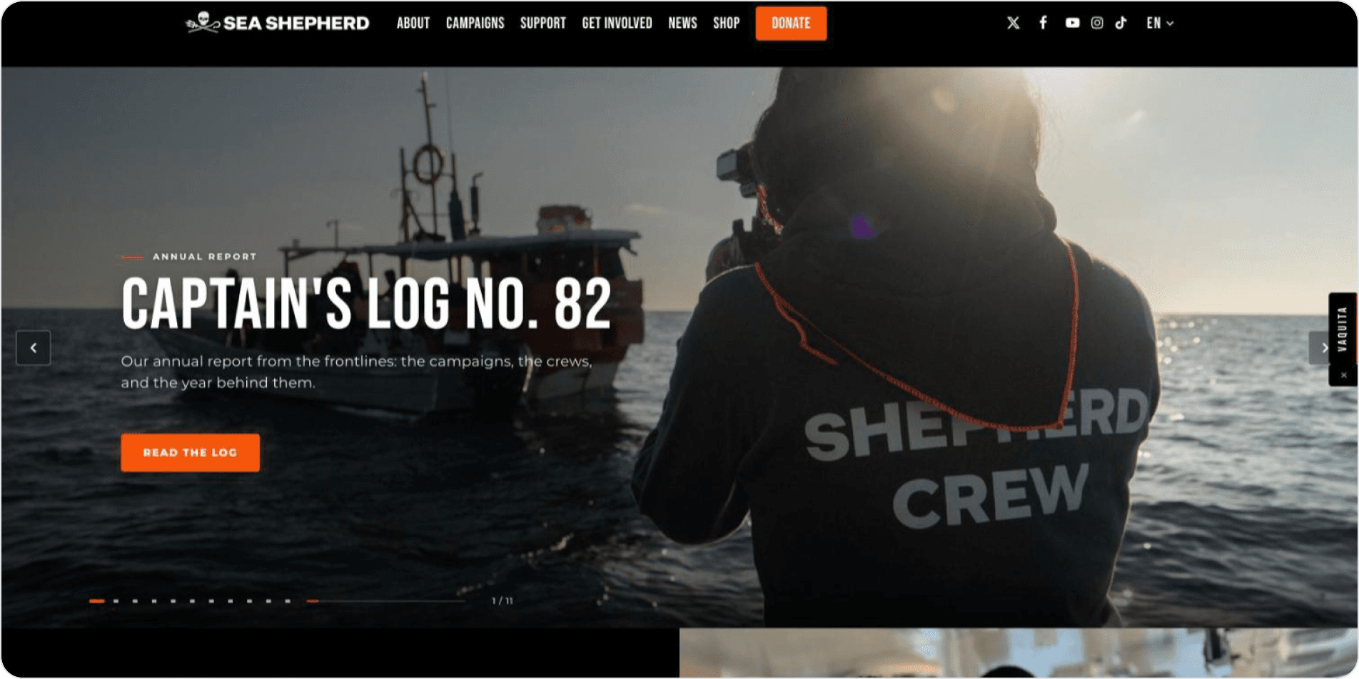
Before
Eleven rotating slides, white text on orange
After
A single fixed hero with a readable button
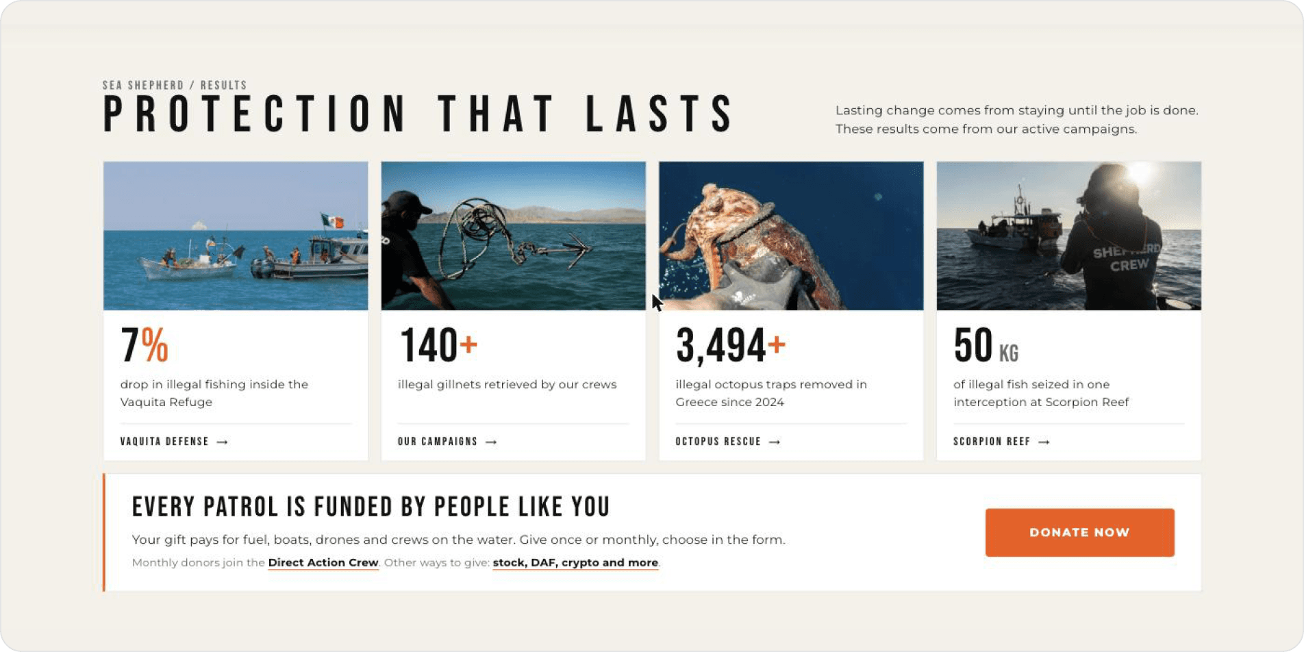
Before · below the fold
Results, then a donation banner with white-on-orange text
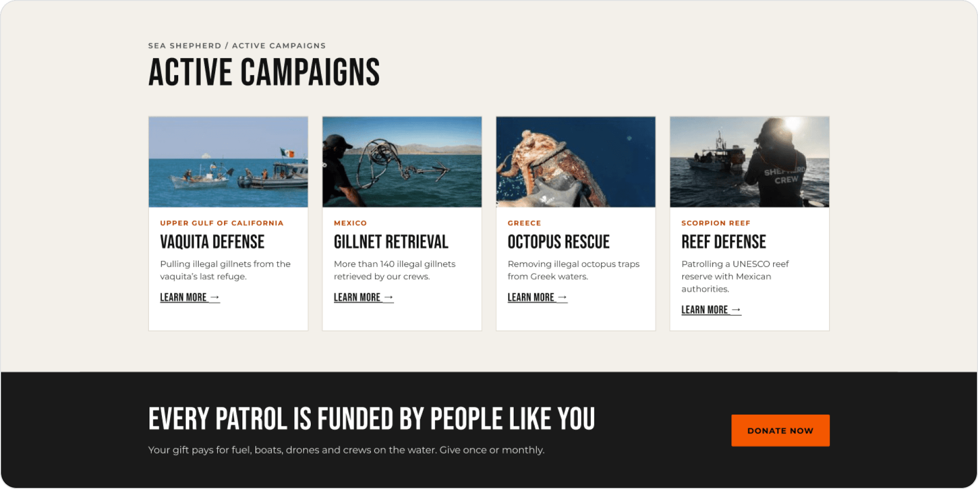
After · below the fold
Campaigns instead of numbers, then the banner with black-on-orange text
Shop: proof before products
The shop takes the home page’s header, orange and results, so it feels like the same organisation.
Same identity
One header, one orange.
The logo, menu and colours match the home page.
Clear buttons
Three states instead of thirteen.
“Add to cart” is black on orange (6.2:1).
Trust
Where your money goes.
A results strip and a donation option sit above the product grid.
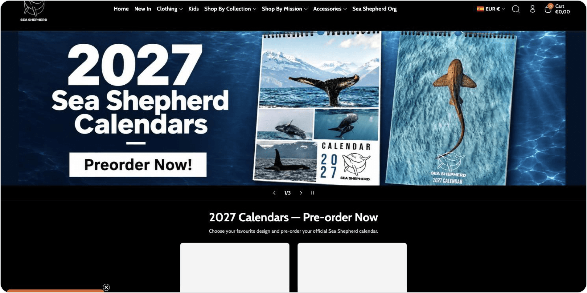
Before
A calendar promo leads, with white-on-orange buttons
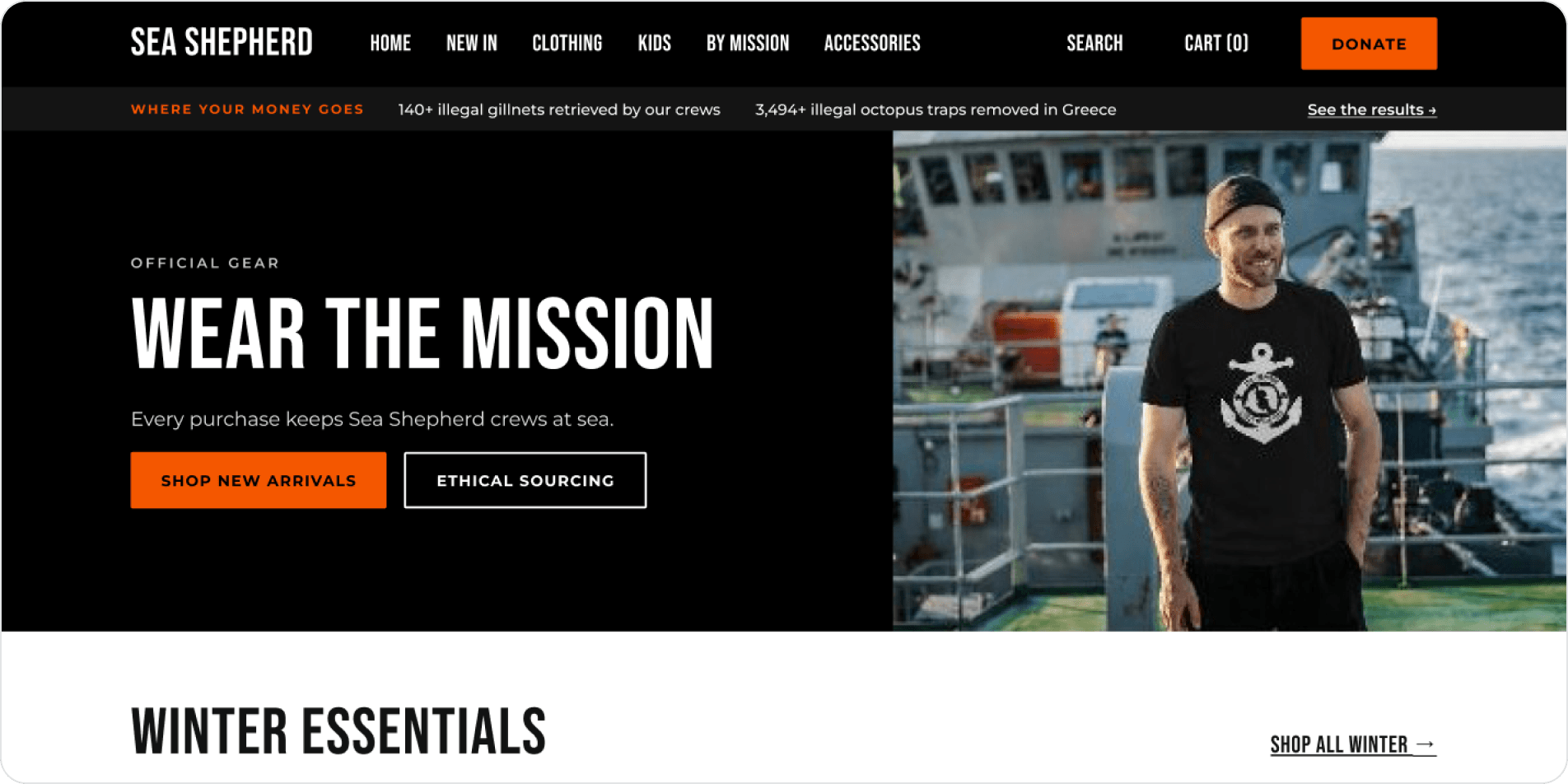
After
Impact proof right under the menu, then the collection
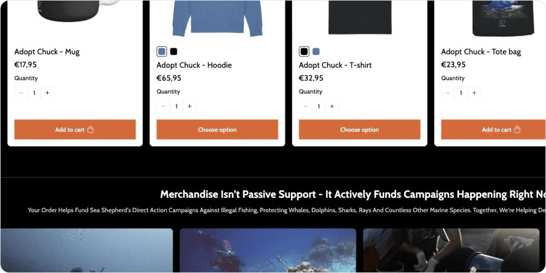
Before · products and sourcing
Buttons that change label and icon from card to card
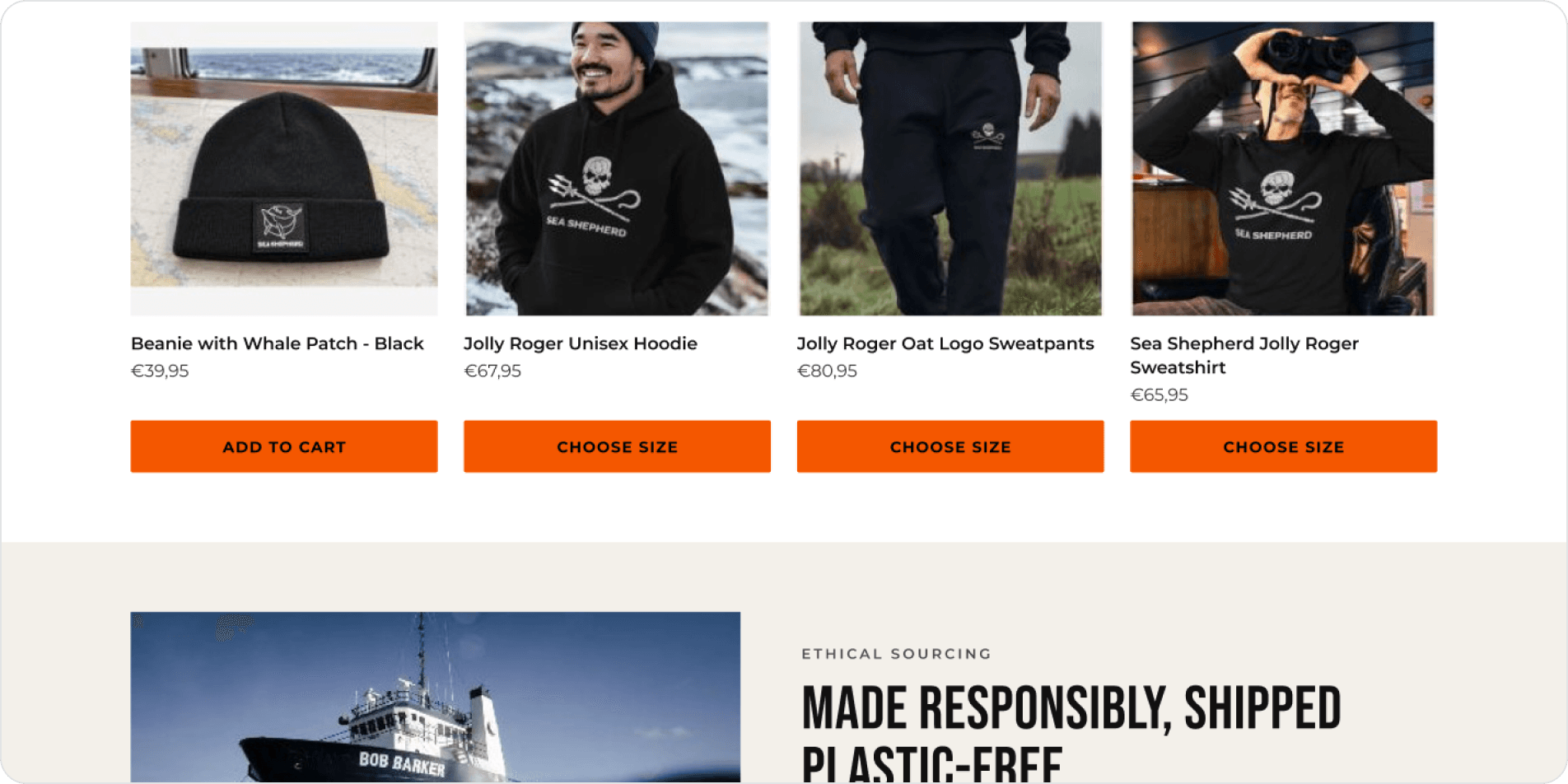
After · products and sourcing
Same button style and place on every card; sized items ask for a size first
Reflection
What this project taught me
Checking contrast, alt text and button size one by one showed me where accessibility really breaks.
What worked
The method. Checking one thing at a time, like contrast, alt text and target size, made every finding concrete. The Tarot cards made me look at trust, not only usability.
What I would do next
Test the new designs with screen reader and low-vision users, and send the review to Sea Shepherd.
Giving something back
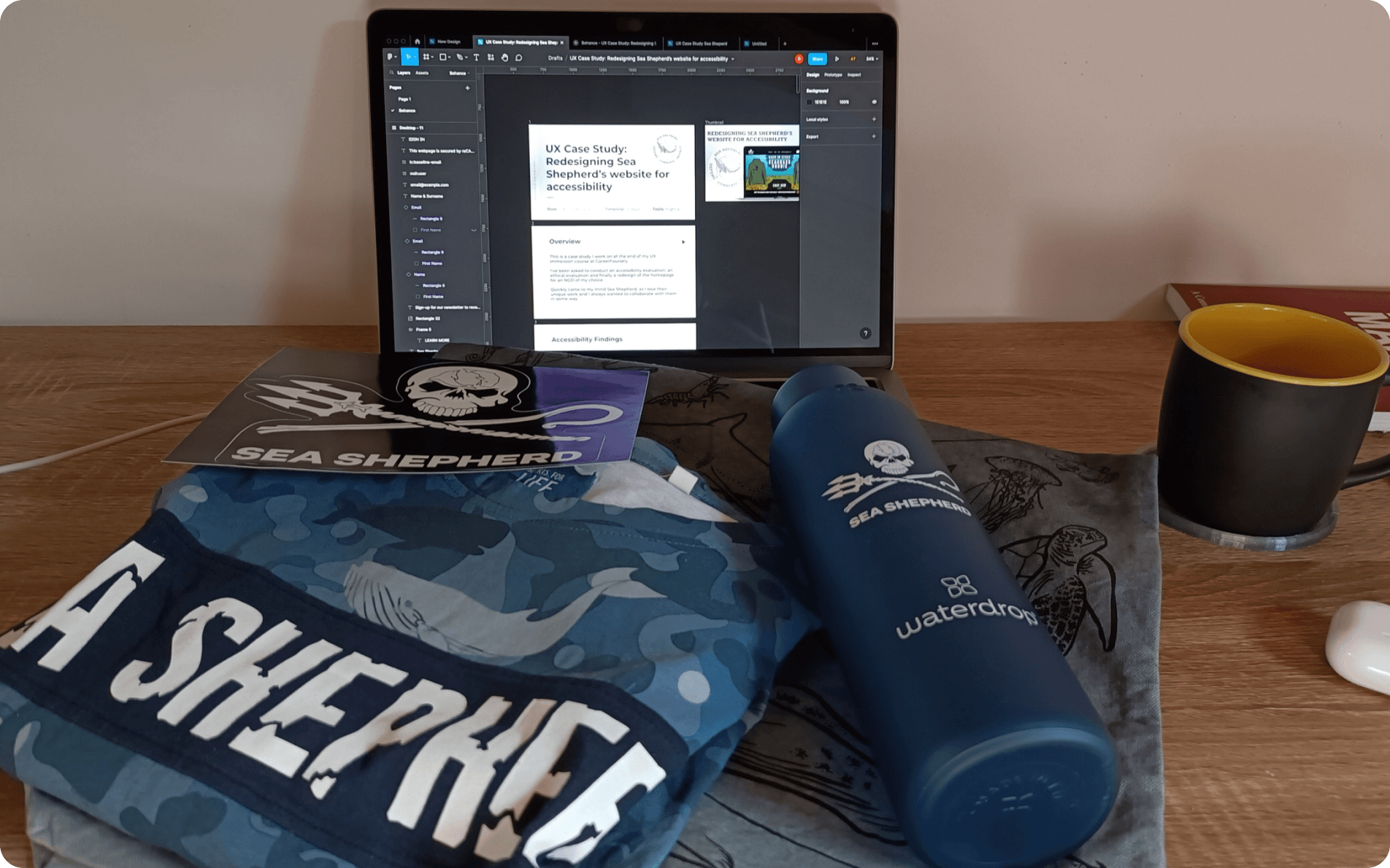
Using an NGO for a case study and offering nothing in return didn’t feel right, so I ordered a few items from its shop to support the cause.