TL;DR
I joined Vkind as a contractor to redesign the app before a company event. We worked across three time zones, mostly asynchronously with a couple of calls a week; earlier designs lived outside Figma, the brand colour changed weeks before the deadline and there was almost no time for discovery. I built a style guide, redesigned the screens, shipped two new flows and ran the company’s first user research alongside the design work.
- App updates launched in four months
- 12
- User interviews, a first for the company
- 5
- New flows built for the company event
- 2
Overview
Redesigning an app for its launch event
Vkind is a lifestyle app. I joined as a contractor to redesign its UI for an upcoming event, with a fixed launch date and a brief that put visual assets before UX. The team was spread across three regions: developers based in India, marketing and stakeholders in the US, and me in Europe. Research ran in parallel with the design work, from guerrilla research and internal testing to surveys, user interviews and the organisation’s first personas.
Challenges
Four constraints shaped every decision
A tight timeline and a team spread across India, the US and Europe meant choosing tools and habits that saved time from day one.
Challenge 01
Asynchronous communication.
We worked across three time zones, and collaboration tools had not been widely adopted. I proposed Figma so everyone could open the prototypes and leave comments right on the designs, which kept feedback moving between our couple of calls a week.
Challenge 02
Designs locked in Photoshop.
Earlier designs lived in Photoshop files we had no access to, so no one could see or share a full flow. I created a basic style guide in Figma as a single source of truth, for consistency, efficiency and scalability.
Challenge 03
A brand colour change.
The company chose new primary brand colours a few weeks before the deadline. Because the style guide was built on Figma colour styles and variables, the change itself took little time. Most of the effort went into checking accessibility with the new primary colour.
Challenge 04
Little time for discovery.
With insufficient time, I validated my designs through guerrilla testing and internal testing.
Redesign
From a style guide to finished screens
Visual work came first, so I started with the foundations and built up from there.
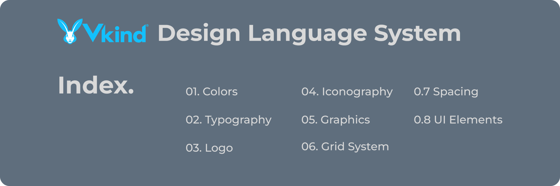
Starting with the style guide
A Design Language System covering colors, typography, logo, iconography, graphics, grid, spacing and UI elements, so the design process stayed consistent, efficient and scalable.
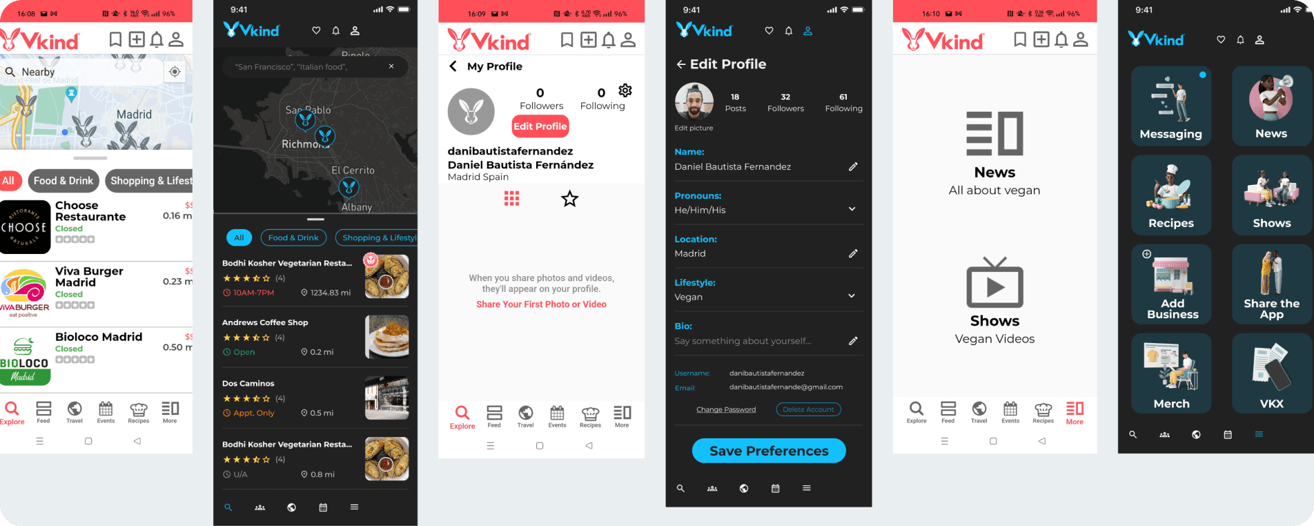
Redesigned screens
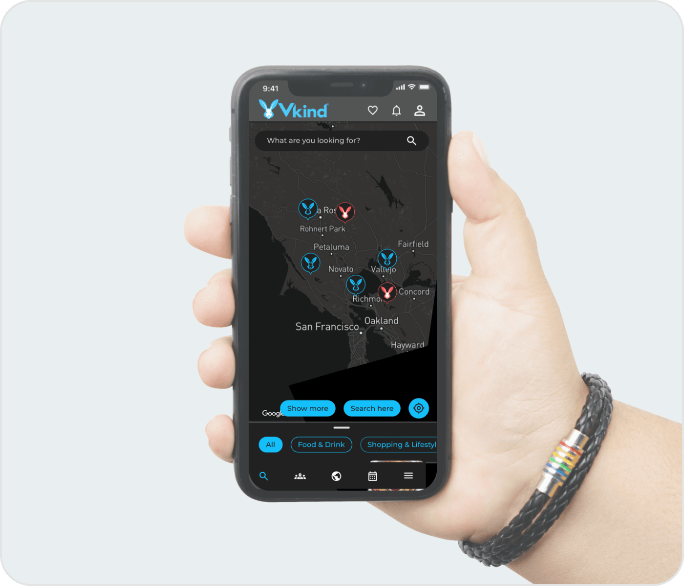
I simplified the navigation by removing some icons to reduce cognitive load. Once the new setup was approved, I refined the remaining components and added them to the style guide.
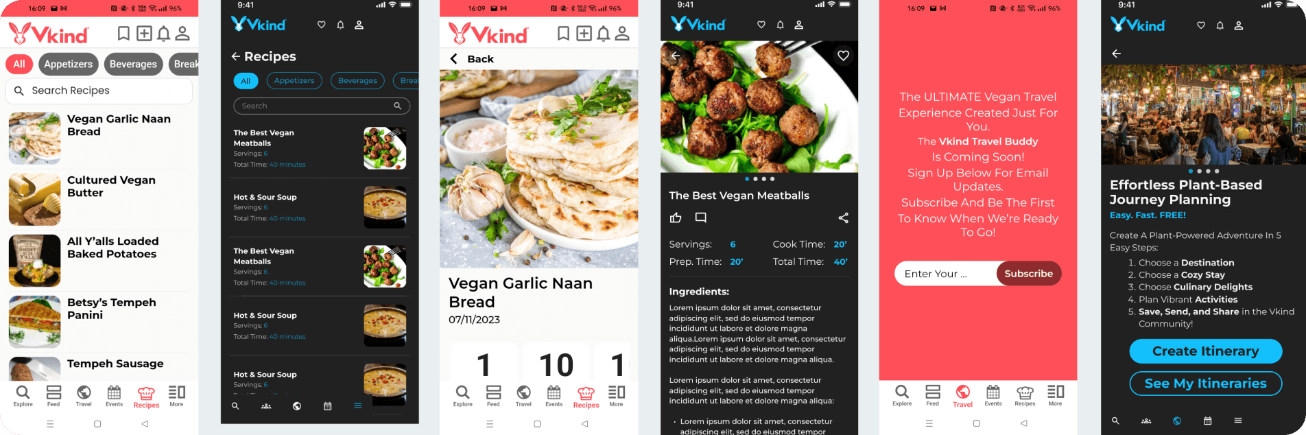
Recipes and travel
More screens redesigned with the same components.
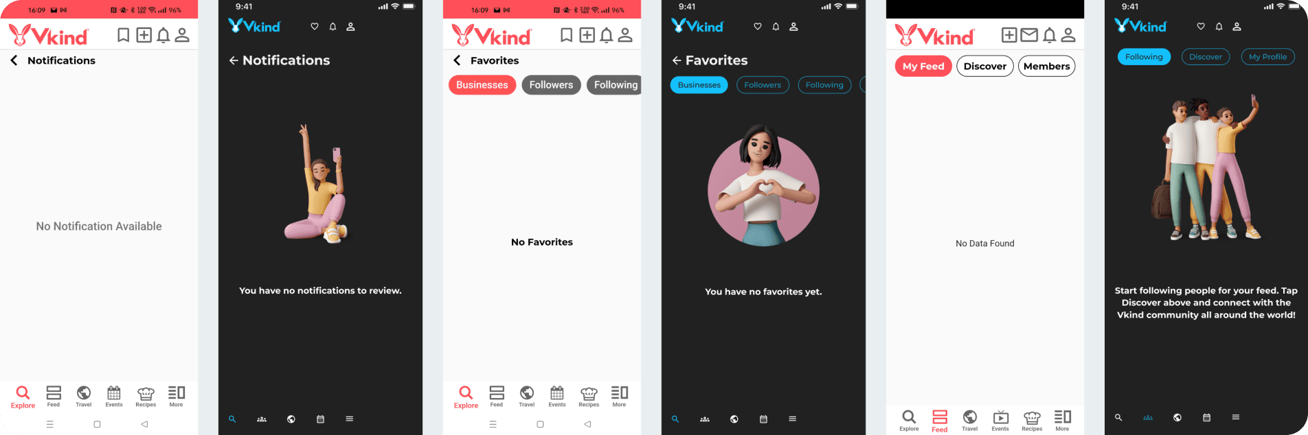
Empty states with a human touch
In interviews, people described the app as a bit flat and impersonal. Vkind is built by people, for people: a community around a way of living. So I designed illustrated empty states featuring people, which gave the app a warmer tone, especially at the start of the user journey, where empty states appear most.
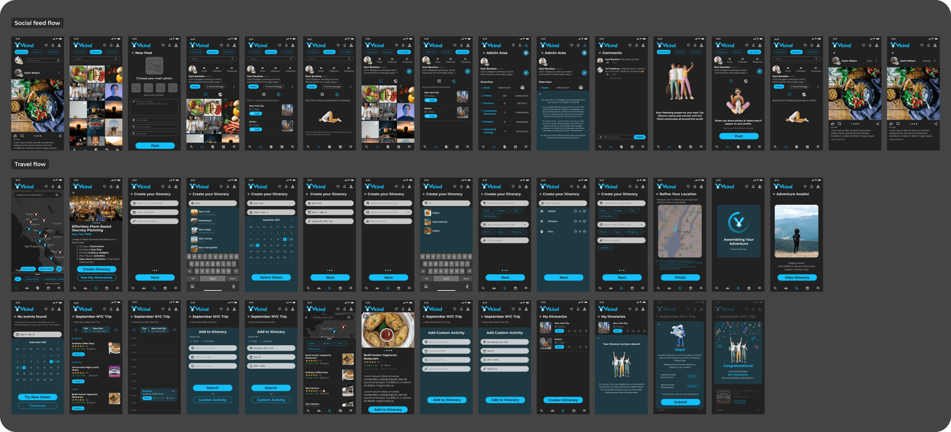
Two new flows for the company event
Both features were heavily promoted on social media and at the venue. A few colleagues and I tested the workflow, spotted improvements and bugs, and worked closely with the developers to get the designs implemented properly.
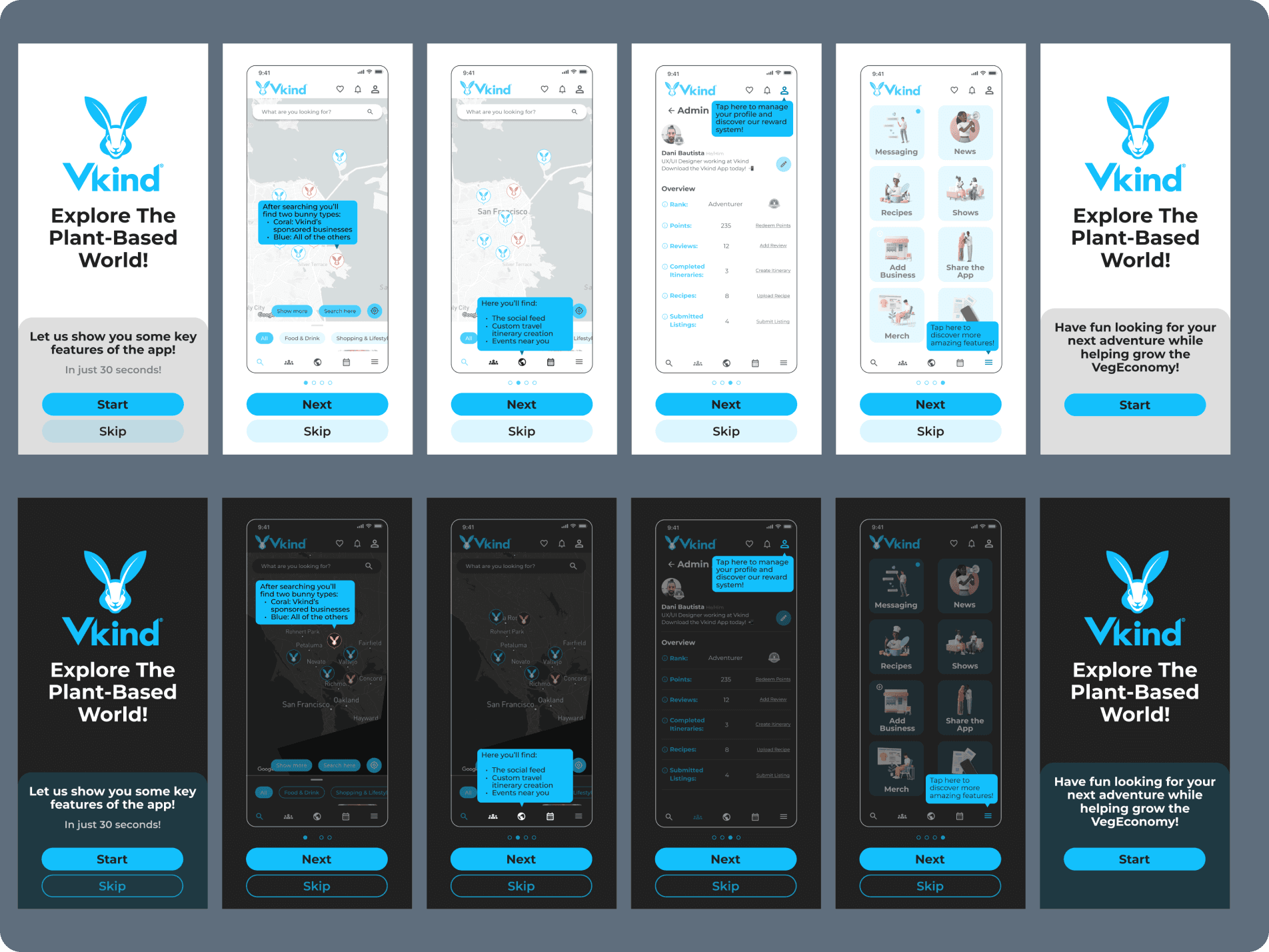
Guiding new users
Many features were hard for first-time users to discover, so I designed a short onboarding that introduces the navigation buttons, with the option to skip it.
Accessibility
A new primary colour, checked for contrast
Changing the primary colour late meant re-checking every screen. The new blue looked good, but it did not pass contrast on its own.
Finding 01
White text on the new blue fails.
The new primary blue (about #13C0FC) gives only 2.1:1 against white text, below the 4.5:1 that WCAG AA asks for. It affected every filled button and chip.
Finding 02
Blue on white is too light.
As an icon, link or active state on a white background it also reaches 2.1:1, below the 3:1 minimum for interface components. On dark backgrounds it passes (7.7:1).
The fix
Dark text on blue, a deeper blue for text.
Buttons use near-black text on the brand blue (8.3:1). For text and icons on white, a deeper blue of the same hue (#027CA6, 4.7:1) replaces the brand blue. Colour styles and variables made both changes quick.
UX research
The company’s first user research
Research ran alongside the redesign, not only at the end. Interviews, an affinity map, a persona and a survey gave the team something to build on.
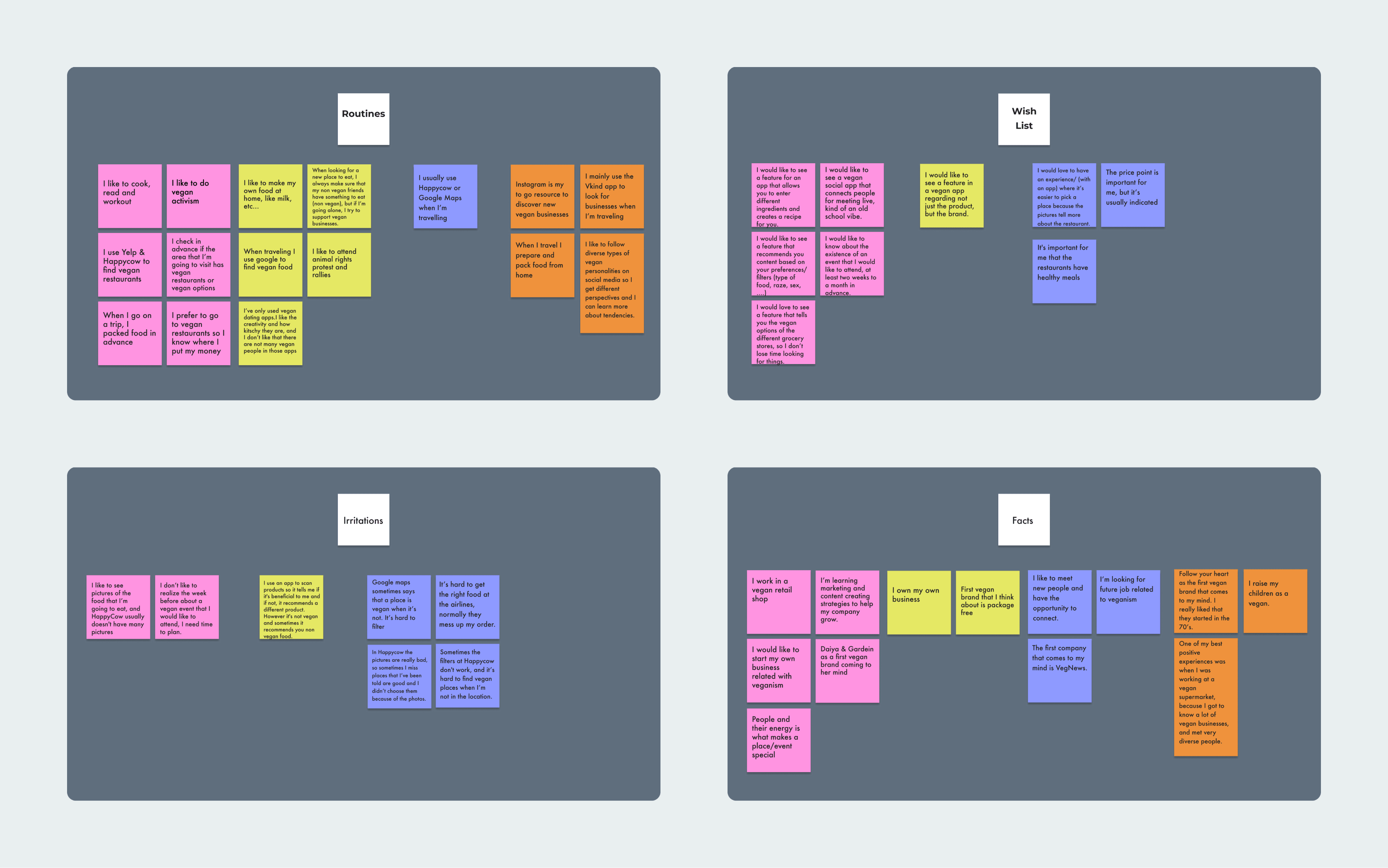
User interviews and affinity mapping
The company had never run user interviews. I set the research goals and worked with marketing to recruit five people familiar with the brand for 30-minute Zoom interviews, then built an affinity map to find key themes and common pain points.
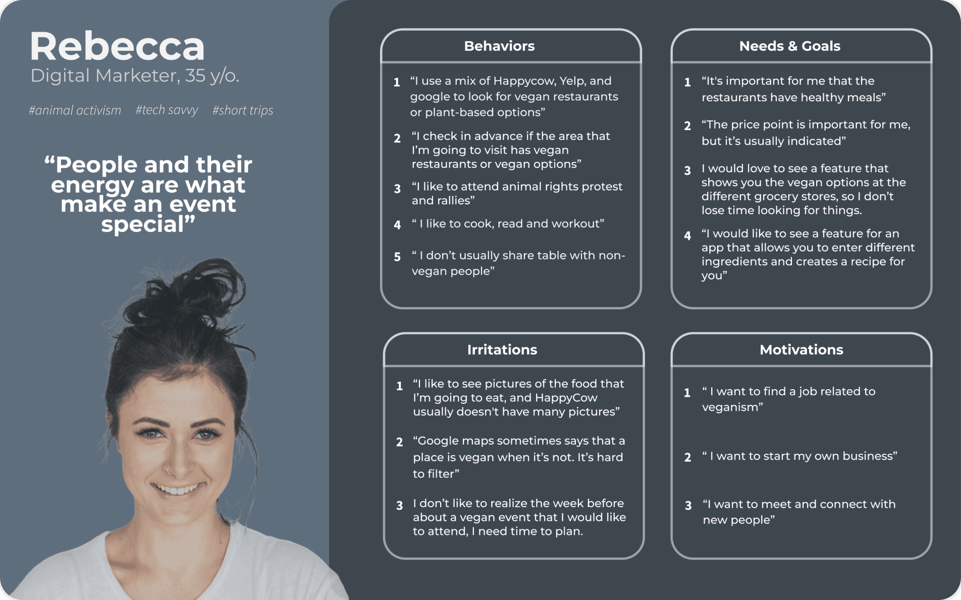
The first user persona
Based on the analysis, I created the first user personas, so future designs meet the goals and needs of the target audience.
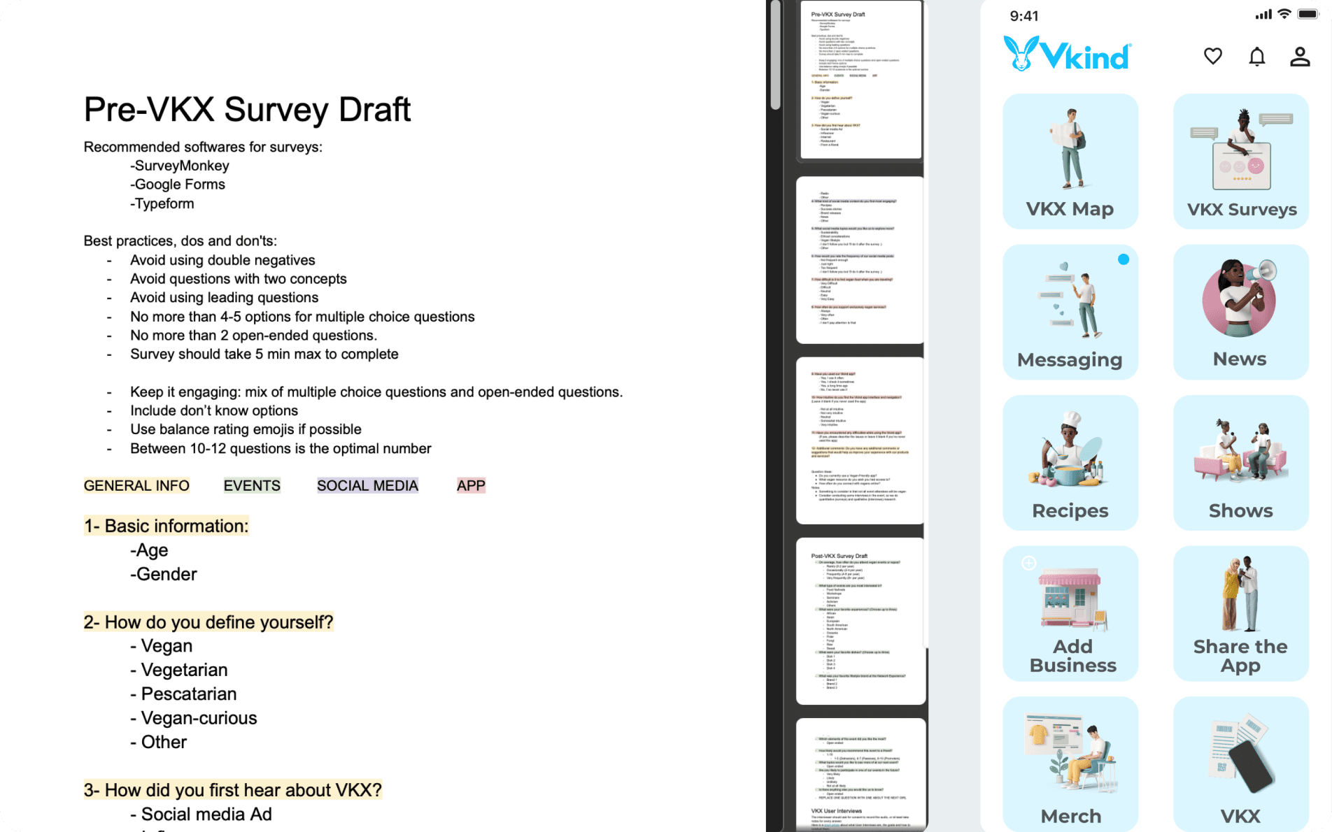
A survey for event attendees
The company event was a chance to gather feedback on the app. I developed the survey with the marketing team for attendees to complete during the event.
Reflection
Leading design on a tight clock
Leading the design decisions on a tight clock taught me to put the work where it moves the product most: foundations first, then screens, with research running alongside instead of waiting for the end. Working for a company that matched my values made it even more motivating.
Collaboration is part of the design
Fluid communication in a distributed team was the key lesson. Working mostly asynchronously across three time zones, with Figma comments as our shared thread and a couple of calls a week, kept everyone moving in the same direction.
Research across cultures
Interviewing participants in the US while working from Europe was challenging, and a great way to strengthen my cross-cultural communication and research practice.